Partial least squares discriminant analysis (PLS-DA) is an adaptation of PLS regression methods to the problem of supervised clustering. It has seen extensive use in the analysis of multivariate datasets, such as that derived from NMR-based metabolomics.
In this method the groups within the samples are already known (e.g. experimental groups) and the goal therefore is to determine two things —
- Are the groups actually different?
- What are the features that best describe the differences between the groups?
In an experimental context this means determining whether control and test samples are different, and identifying the (known, quantified) experimental variables that contribute to that difference.
PLS-DA is based on PLS regression (PLS-R) with the Y variable generated from experimental group membership, mapped into a linear space. In a 2-group experiment this can be as simple as 0 and 1.
Setting up
The implementation of PLS we will be using is provided by the scikit-learn
library. We will also be making use of matplotlib for plotting our outputs
and pandas for some basic data handling.
pip install scikit-learn matplotlib pandas
The sample data for this example is available for download
Download and unzip the file into your data folder.
For this demo we will start with 1D 1H NMR data as it makes explanation and visualization of the PLS models easy to understand. However, later we will also generate PLS-DA models for other data types, to demonstrate how you can easily apply these same methods to any type of multivariate data set.
Loading the data
Before starting, let's take a look at the data we are working with.
Create a new Jupyter notebook using the Python 3 kernel, and in the first cell
enter and run the following. This will import all the neccessary libraries, as
well as using the %matplotlib magic to display output figures in the notebook.
%matplotlib inline
import matplotlib.pyplot as plt
import numpy as np
import pandas as pd
import sklearn
import os
plt.style.use('ggplot')
We will start by loading the data. The source data is provided in CSV format with experimental samples along the horizontal axis and spectral variables (ppm) along the vertical axis. In addition to the a sample number, there is also a sample group (class) from the experiment).
There are many ways to load this data, but using pandas allows
us to keep the elements of the data together nicely.
df = pd.read_csv('data.csv'), index_col=0, header=[0,1])
df
Visualising the dataset
Let's plot the raw data to begin with to get an idea of what we're working with.
We can use the build in pandas plot functions to do this quickly.
df.plot(kind='line',legend=False, figsize=(12,4))
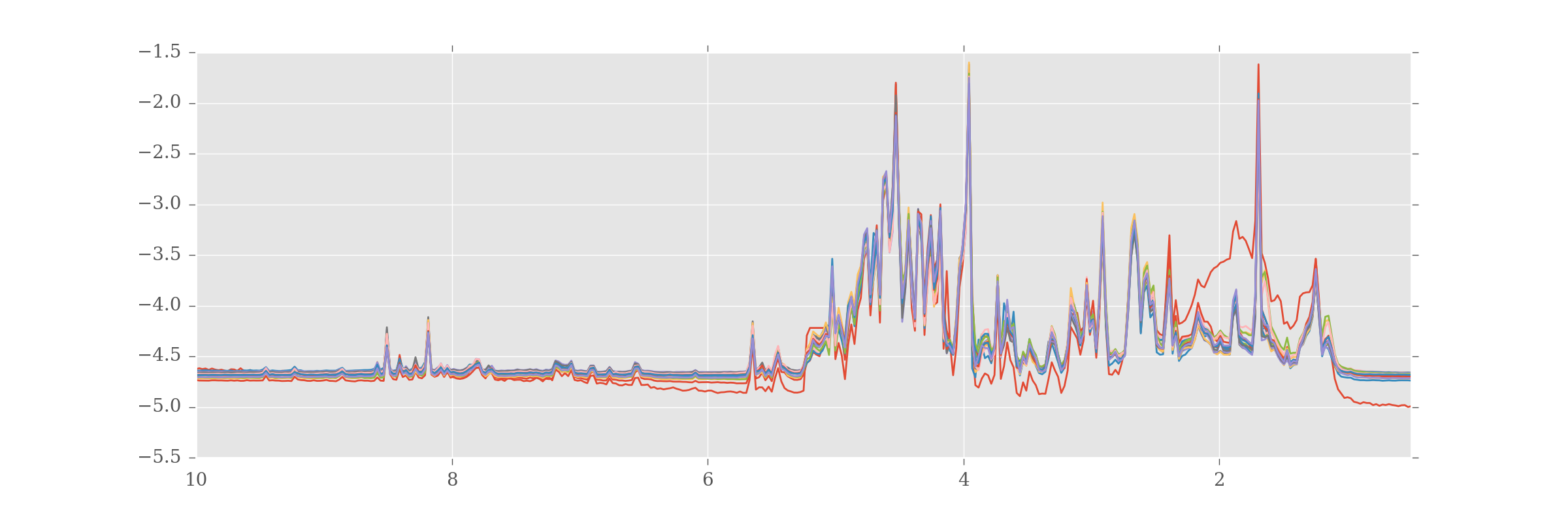
If you look closely you'll see most of the samples look very alike, but there is one (in red) that looks very unusual. This will become important later.
You might be interested to see experimental groups plotted the same color. The
information on experimental groups is stored in the Pandas column MultiIndex
'Group', and can be retrieved using:
df.columns.get_level_values('Group')

Index([u'H', u'N', u'N', u'N', u'N', u'N', u'N', u'N', u'N', u'N', u'H', u'H',
        u'H', u'H', u'H', u'H', u'H'],
        dtype='object', name=u'Group')
As this is basically a list of values ("N" or "H", one for each sample) we can use this, together with a dictionary colormap, to plot samples from each group in a single colour.
colormap = {
    'N': '#ff0000',  # Red
    'H': '#0000ff',  # Blue
}

colorlist = [colormap[c] for c in df.columns.get_level_values('Group')]

df.plot(kind='line', legend=False, figsize=(12,4), color=colorlist)
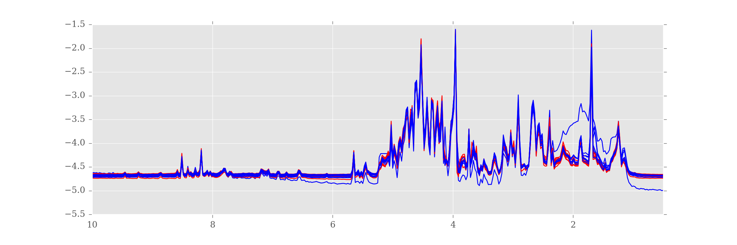
Now we can see that the dodgy sample is from the "H" (blue) group.
Building the model
Let's now perform the PLS-DA. As already described, to do this we need to create a pseudolinear Y value against which to correlate the samples. Since we have only two sample groups we can do this very easily.
y = [g == 'N' for g in df.columns.get_level_values('Group')]
y


[False,
    True,
    True,
    True,
    True,
    True,
    True,
    True,
    True,
    True,
    False,
    False,
    False,
    False,
    False,
    False,
    False]
Next we convert the boolean values into 0 and 1 by setting the dtype on the array.
y = np.array(y, dtype=int)
y


array([0, 1, 1, 1, 1, 1, 1, 1, 1, 1, 0, 0, 0, 0, 0, 0, 0])
If you have more than 2 groups, but want to perform a similar 2-group analysis, you can filter the DataFrame using Pandas indexing.
Next we apply fit a PLS-DA model to our data. We must specify the number of components, or latent variables (LVs), to use for our data.
from sklearn.cross_decomposition import PLSRegression
plsr = PLSRegression(n_components=2, scale=False) # (1)
plsr.fit(df.values.T, y) # (2)
- We select 2 components, with autoscaling off.
- The algorithm expects data to be in the transpose, with samples in the horizontal axis and features in the vertical.
Scores and weights
The key elements of a PLS-DA are the scores and weights of the model. The scores describe the position of each sample in each determined latent variable (LV). Notice how there are two columns, one for each LV, and 17 rows, one for each sample. You can see the scores as follows:
plsr.x_scores_

array([
    [-3.89611177,  0.63670615],
    [ 0.45130405,  0.2670518 ],
    [ 0.57231162,  0.21282613],
    [ 0.49461256,  0.14515445],
    [ 0.56241956,  0.09096893],
    [ 0.6650397 ,  0.27074594],
    [ 0.49613275,  0.35219217],
    [ 0.10264215,  0.51124086],
    [ 0.58655054,  0.27135712],
    [ 0.73518884,  0.11557932],
    [ 0.58786011,  0.08883542],
    [-0.64436773, -0.88135558],
    [-0.5939848 , -0.83145755],
    [-0.5002382 , -0.81607976],
    [ 0.13732602, -0.17700316],
    [ 0.17014101, -0.15633072],
    [ 0.07317358, -0.10043153]
])
In contrast, the weights describe the contribution of each variable to each LV. You can view the shape of the weights as follows. Again there are 2 columns, one for each LV and 383 rows, one for each variable.
plsr.x_weights_.shape
You can remove the .shape to see the full list of data, but it's rather long.
This isn't very enlightening in itself so lets plot these values. Again,
we'll generate a DataFrame to simplify the plotting. As samples are in the rows
in the scores array, we assign an index from df.columns.
scores = pd.DataFrame(plsr.x_scores_)
scores.index=df.columns

ax = scores.plot(x=0, y=1, kind='scatter', s=50, alpha=0.7,
                    c=colorlist, figsize=(6,6))
ax.set_xlabel('Scores on LV 1')
ax.set_ylabel('Scores on LV 2')
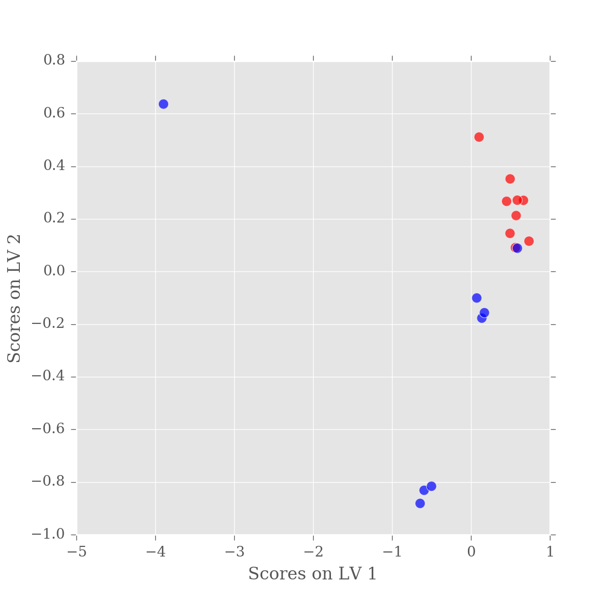
So we have good separation between our sample groups, however it is in LV2. While practically this has little effect, the fact that the major variation in our data is not between our sample groups is a little alarming. Remember, PLS-DA is a supervised approach, whereby the algorithm is specifically tuned to find the difference beteen the groups. So, what is happening?
If you think back to when we first plotted the data, there was an ugly looking sample in the dataset — a blue spectra that was very different to all the others, with artefacts and bumps. The variation in this sample is so large that it is swamping the difference between our samples.
So, which sample is it. Let's look at the scores DataFrame.
scores

0         1
Sample Group
101    H     -3.896112  0.636706
103    N      0.451304  0.267052
105    N      0.572312  0.212826
107    N      0.494613  0.145154
109    N      0.562420  0.090969
111    N      0.665040  0.270746
113    N      0.496133  0.352192
115    N      0.102642  0.511241
117    N      0.586551  0.271357
119    N      0.735189  0.115579
85     H      0.587860  0.088835
89     H     -0.644368 -0.881356
91     H     -0.593985 -0.831458
93     H     -0.500238 -0.816080
95     H      0.137326 -0.177003
97     H      0.170141 -0.156331
99     H      0.073174 -0.100432
We're looking for a sample with a score in LV1 (column 0) of ~ -4.0. The only sample in the scores with that sort of value is Sample=101, in group "H". We could also plot sample numbers on the figure as follows:
scores = pd.DataFrame(plsr.x_scores_)
scores.index=df.columns

ax = scores.plot(x=0, y=1, kind='scatter', s=50, alpha=0.7,
                    c=colorlist, figsize=(6,6))
ax.set_xlabel('Scores on LV 1')
ax.set_ylabel('Scores on LV 2')

for n, (x, y) in enumerate(scores.values):
    label = scores.index.values[n][0]
    ax.text(x,y,label)
Iterating over scores.values would return a tuple of values, one for each column.
This means we can do for x,y in scores.values: to get the x,y values.
However, we also need the index (row) in order to get the label for the sample. To get
an index, we wrap the scores.values in enumerate. Each loop generates a tuple, containing
the index and the tuple of x,y which is then unpacked by (n, (x, y).
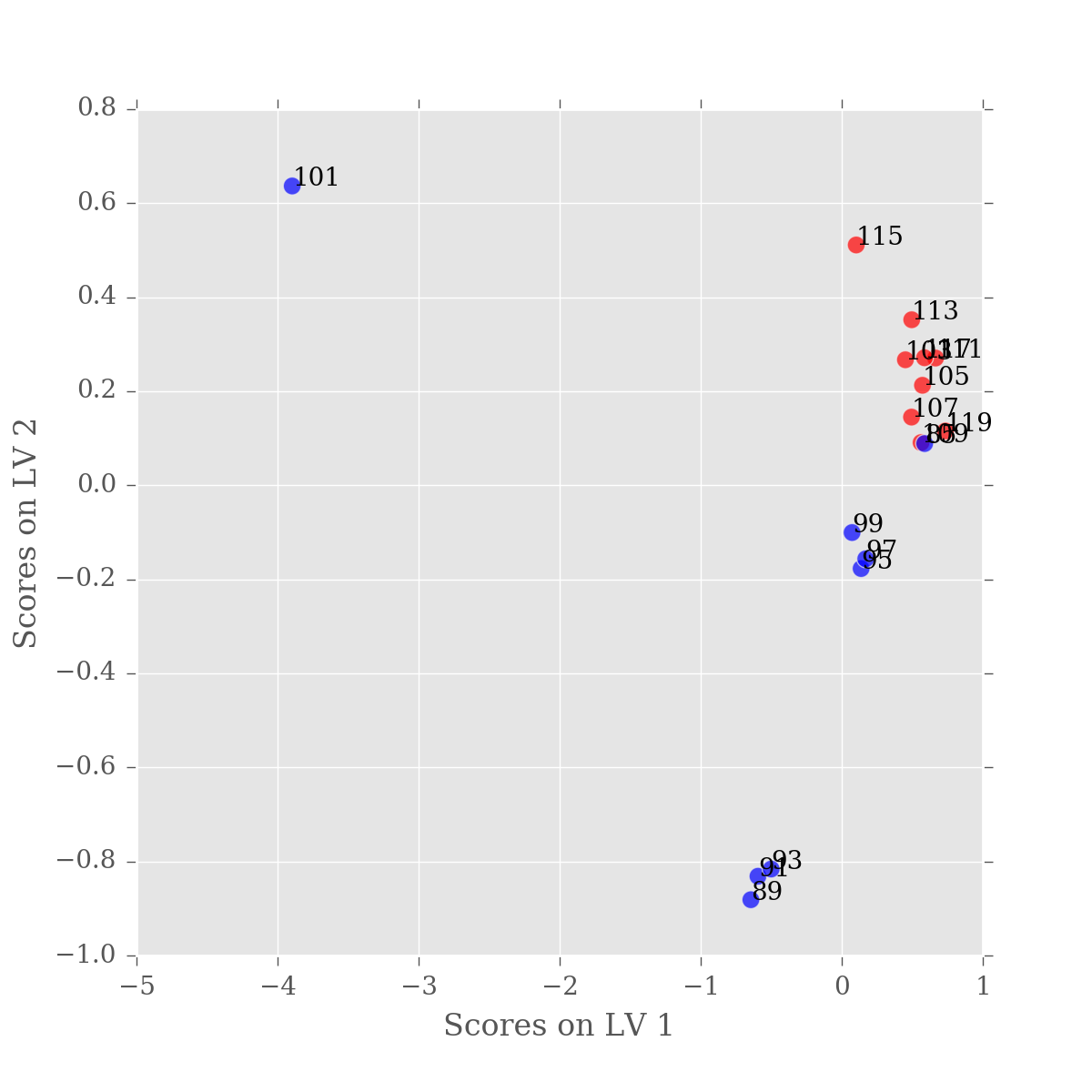
Now we know which sample is causing the problems, let's remove it.
f_df = df.iloc[:, df.columns.get_level_values('Sample') != '101']
f_df
We can do repeat the analysis so far, with the excluded value. Note that we also need to update the colormap.
f_colorlist = [colormap[c] for c in f_df.columns.get_level_values('Group')]
f_y = np.array([g == 'N' for g in f_df.columns.get_level_values('Group')], dtype=int)

from sklearn.cross_decomposition import PLSRegression
f_plsr = PLSRegression(n_components=2, scale=False)
f_plsr.fit(f_df.values.T, f_y)
Let's plot the PLS-DA model built using filtered values.
f_scores = pd.DataFrame(f_plsr.x_scores_)
f_scores.index=f_df.columns

ax = f_scores.plot(x=0, y=1, kind='scatter', s=50, alpha=0.7,
                    c=f_colorlist, figsize=(6,6))
ax.set_xlabel('Scores on LV 1')
ax.set_ylabel('Scores on LV 2')

for n, (x, y) in enumerate(f_scores.values):
    label = f_scores.index.values[n][0]
    ax.text(x,y,label)
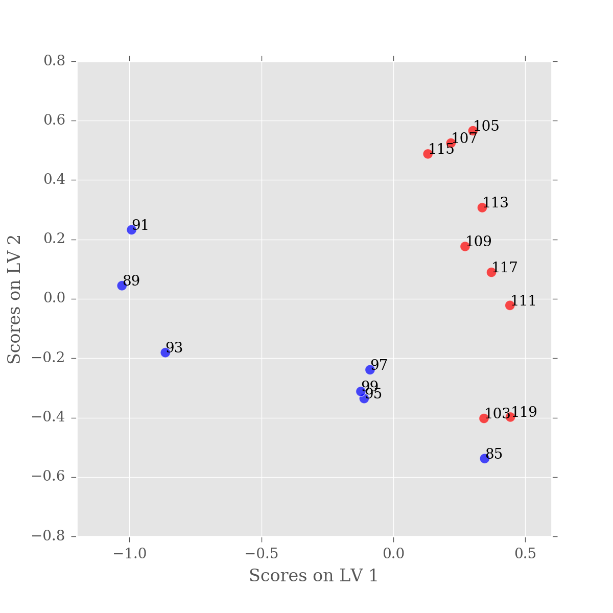
This looks a lot better, the majority of our variation is now in the first latent variable. You'll notice that one of our samples is still mis-classified, but that's just science. As there is nothing objectively wrong with this sample, we just have to accept that our experiment wasn't perfect.
However, if we did want to filter that sample from the DataFrame we could update our filter code as follows:
samples_to_filter = ['85','101']
filter_ = [s not in samples_to_filter for s in df.columns.get_level_values('Sample')]
ff_df = df.iloc[:, filter_ ]
